Small Name Writers…
Something I Find Stunning…
Readers buy book by not only what their front brain thinks of the sales copy and the cover, but more than that, readers (all of us) buy books because of subconscious clues.
Clues like:
- —Cover art not professional
- — Cover art not to genre or book title impossible to read
- — Book sales copy dull and passive and gives too much plot away.
- — Book interior so poorly formatted as to be impossible to read.
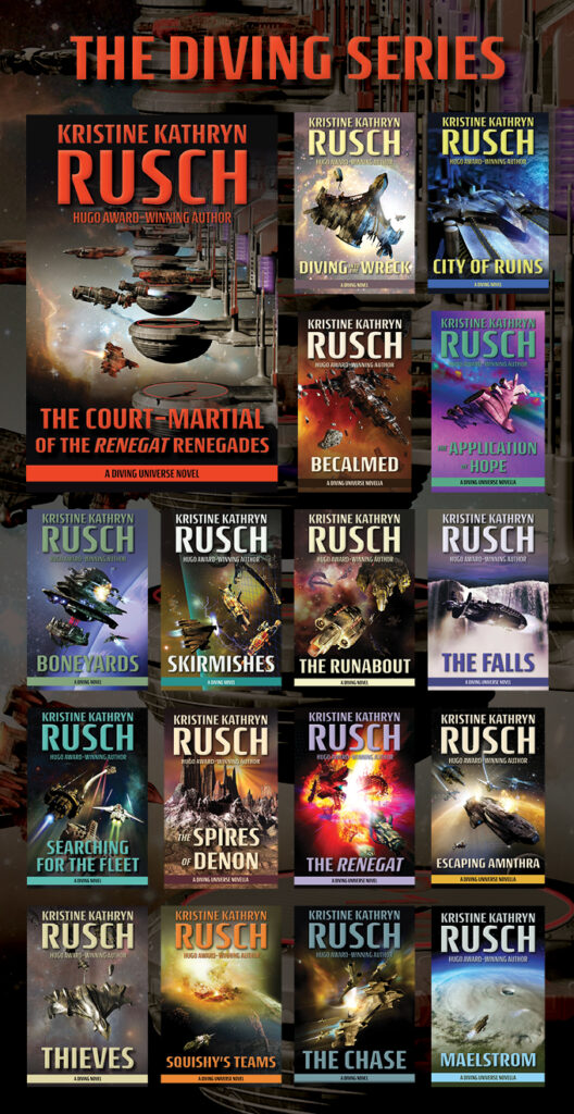
There are others, but one major clue that helps readers trust that the book is done by a professional and it will be entertaining is the size of the author name on the cover.
Yes, size does matter.
Traditional publishing ground one simple concept into readers minds for 50 years.
The bigger the author name on the cover, the better the book will be.
That is where the term “big name author” came from.
A beginning writer with a first book would always have a small name on the book. Roberts, Cussler, Koontz names fill the top third of the book cover.
So suddenly here comes indie publishing and authors, full of fear, put their name down on the bottom of their books in small print. And then wonder why they get no sales.
Duh…
Your author name should fill from side to side over the top third of every book you write. You should be shouting that you are a big name author to your readers. (There are a few genre common things that tell readers of that genre you are a big name, but mostly it is size.)
So if you want more sales, believe your books are worth reading, then start acting like it and put your name on the top of your books in large form.
Be a big name author.
Start building your author brand.
10 Comments
Glyn
I know where you’re coming from, but RUSCH & SMITH are short surnames.
What about long ones? Like mine SALISBURY.
dwsmith
Just make it work. Lots and lots of design features. Find other major bestsellers who have long names and see how they do it.
Vincent Zandri
Too true Dean. Delacorte gives me 250k for two books back in ’99. My first. I get the first cover draft (in the mail back then), and I’m so young and excited I can hardly wait to show the old man (who then was about 5 years younger than I am now). He looks at it, shakes his head and says, “You can hardly see your name, Vince. Make them make it much bigger.” Naturally I was too young and stupid to rock the boat.
Alexander Boukal
Why do books by big name authors sometimes have their names on the bottom rather than the top? Is it because of how they have set up their marketing to license their books for a series?
dwsmith
Art direction and sometimes it is a genre thing. That’s why I shout all the time for writers to study genre covers. Amazing how many writers will do a cover of a book without once looking at other major covers in the same genre.
Sheila
I remember your advice about this from years ago, and always try to make my name as big as possible. I might even end up doing the title smaller so my name can be bigger. 🙂
dwsmith
Title should be smaller. No book is ever sold by title. Author is the main reason people buy books, even if they don’t know the author.
Alicia Butcher Ehrhardt
Thanks, Dean.
Such an easy thing to try – and you’re SO right about newbies (as I was in 2015, publishing the first Pride’s Children mainstream novel, PURGATORY) putting their names in smaller type at the bottom of the cover. TEXTBOOK, even though they’re not genre. Traditionally published literary/mainstream covers are all over the place, but even those have covers with bigger name text.
With all the graphics files at my disposal, when I get to the cover for the third book in the trilogy which I’m writing now, I’ll redo the three covers – in just that detail – and expect some action. Much obliged. If I get some energy, I may even do the first two covers as soon as possible. It can’t possibly hurt.
Martin L. Shoemaker
Kris has the converse of my problem. She has a short last name with relatively long first + middle. She solved it by making the last name cover width and setting first + middle in smaller font to stretch across the same space.
I have a longish last name and shortish first + initial. Trying to stretch Martin L. across the width made it look ridiculous. Trying to fit the whole name on one line made it too small to read in thumbnail. I went with Martin L. small and inset within Shoemaker above the h o e m.
Michèle Laframboise
I, too, have a long surname, but I managed something on my recent books: putting my first name (Michèle, in lower cases) on top of the three first letters of my surname (Laframboise, in uppercases, large font).