Short Story Covers In #46
Laying Out the February Issue of Smith’s Monthly
And I need short story covers.
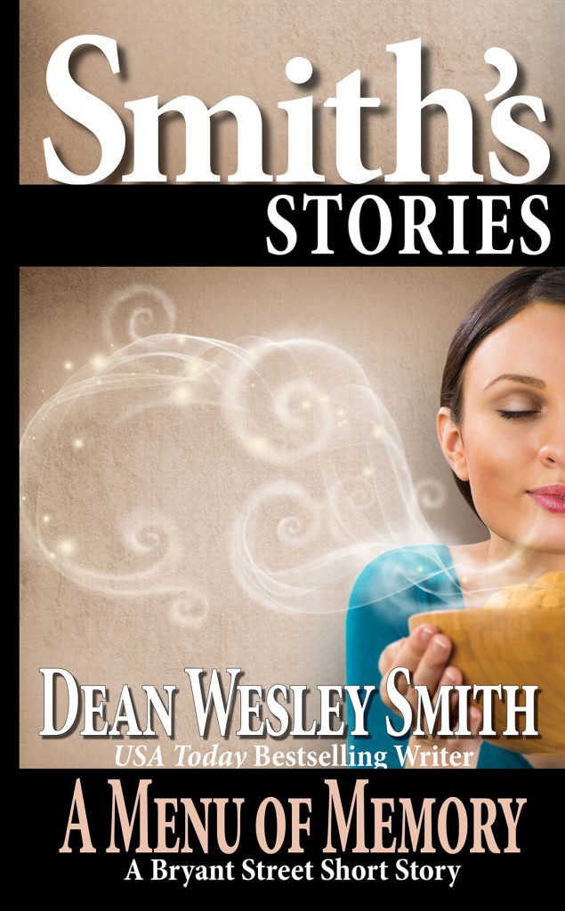
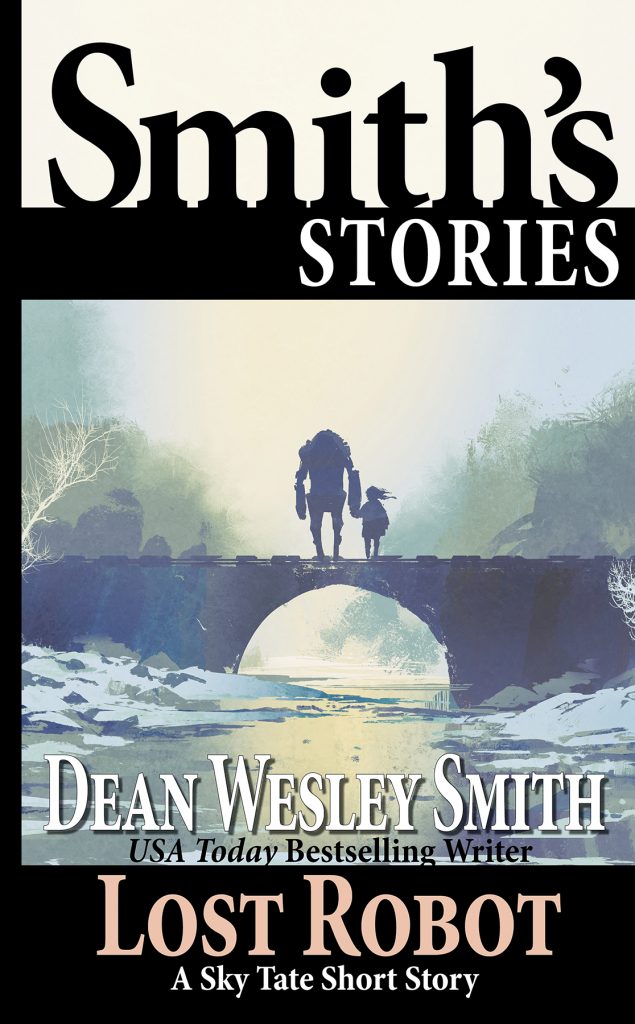
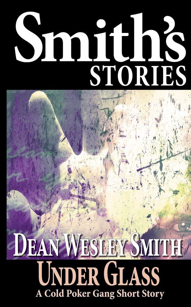
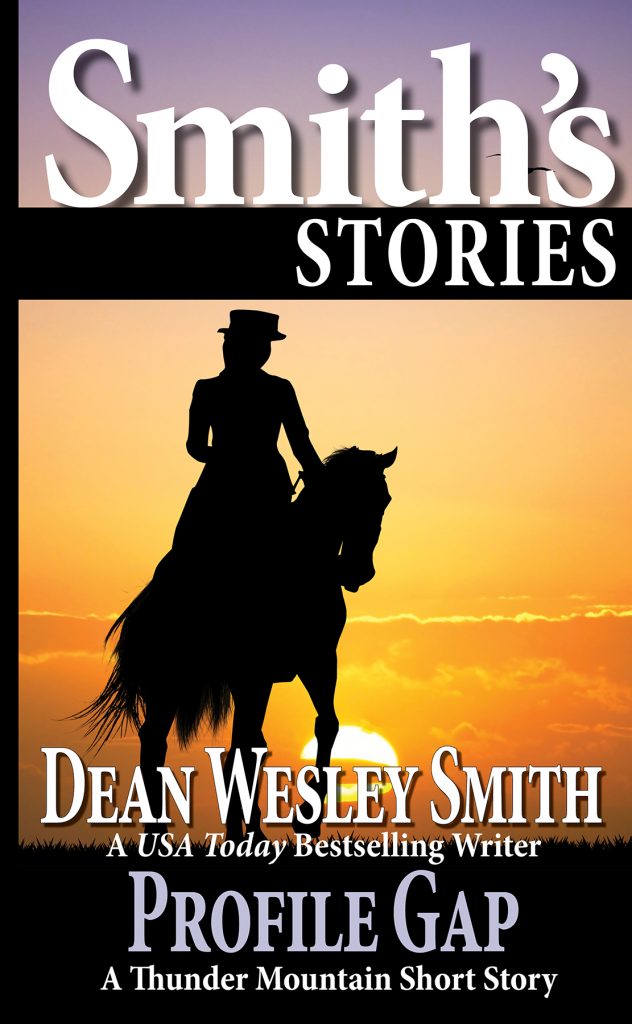
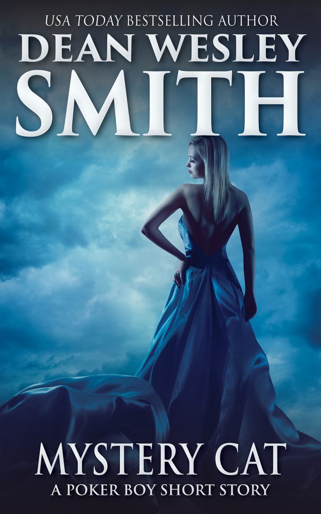
There are five short stories in Smith’s Monthly #46, so I started about 11:30 tonight after Allyson saved me earlier in the evening from my own stupidity with DepositPhotos. So from 11:30 until 1 am, I did five short story covers. Four are in my Smith’s Stories branding look, and Poker Boy stories have their own branding.
But I had templates for both, so the longest time it took was for me to find the art that would fit the story. And in the Poker Boy story, the branding.
The hardest story was the story titled “Lost Robot” which I wrote for this fantastic piece of cover art by Bob Eggleton on Writer’s of the Future #35. I couldn’t use Bob’s wonderful art, so finding something that even pretended to fit was just brutal.
For those of you who knew Kip from the Anchor, the story “Menu of Memory” I wrote in his honor just after he died.
So thought I would show you what I did tonight for covers for the stories in Smith’s Monthly #45. And then I have to head for bed because at 6:30 Kris and I are headed out for a 5K run. One of the few live events recently, so we’re going to have fun, once I wake up.
11 Comments
Mark Kuhn
Covers look great, Dean. Great job especially on the Lost Robot cover.
Wes McBride
Love the covers and the consistent design language. All of the pictures you found look like distinct kinds of stories. The artwork you found for “Lost Robot” is a great find.
Easy tweak if you have time. “A Menu of Memory,” “Under Glass,” and “Mystery Cat” all have a small design issue: tangents. A tangent happens where two shapes at different distances from the viewer line up along an edge, causing the shapes to look like they are at the same depth. This works to your benefit in the cover for “Under Glass.” The fingers lining up with the black border make it look like the border itself is the pane of glass. The tangent in “A Menu of Memory” isn’t too bad. To some viewers it will seem like the woman in the picture is resting the top of her head against the frame. Most viewers will just see the woman as very close to the picture plane. The tangent on “Mystery Cat” should probably be changed. It looks like the woman is wearing a T hat. It doesn’t need much, just a little space between the woman’s head and the letter. Or a clear overlap. I would be tempted to move the image down as it looks like you might have an easy grey to match at the top (should you need to add more image area).
None of these tangents would keep me from reading one of the stories, and the overall mood of the three covers comes through clearly.
dwsmith
Thanks, Wes. Doing these short stories, unless it really pops. I pay no attention to tangents. We sure do, however, on novel and larger book covers.
Thanks! Got a hunch you just sent a lot of people running for dictionary. (grin)
Angelo
You use microstock right? Which site do you use?
dwsmith
Not a clue what that question means. I create my own covers with InDesign.
Kate Pavelle
Dang, you’re fast! I take a whole hour if I’m using stock art, and up to five hours if I’m combining images, balancing light sources, and illustrating in Procreate.
Your speed got me thinking on how to incorporate a template into BookBrush, which is now my preferred way of making “fast” covers (they have a library of images or I import my own, plus it’s easy to turn the new cover into a social media ad or announcement.)
For those of you who also use BookBrush, the hard layout could be saved as a stamp. I’m kicking myself for not thinking of this earlier!
Philip
“The ability to design your own covers.” That’s one of the biggest challenges to doing the Making A Living on Short Stories challenge.
Certain genres I can easily nail, especially crime and westerns. However, I haven’t nailed down good ideas for SF and fantasy. Even horror is tough. Luckily all my stories have been westerns so far in 2021.
Michèle Laframboise
“For those of you who knew Kip from the Anchor, the story “Menu of Memory” I wrote in his honor just after he died.”
You should have put Kip’s wonderful breakfast crêpes on the cover, because this is the meal I remember from the two times I stayed at the Anchor. Kip was a nice and gentle host, and I regret not knowing him more.
So nice to honor him in a story!
dwsmith
Actually, I wrote it for a time I worked with Kip in 1985 at his 99 cent spaghetti restaurant.
James Palmer
That Bob Eggleton cover is fantastic. Writers of the Future was giving away free posters of that cover at Dragon Con 2019, but they ran out before I could get one.
Jo May-Prussak
Have just finished ‘Writing into the Dark’ and think it is just what I’ve needed to inspire me to crack on with my next book without fearing it will take another seven years. Love the robot cover above too… very prescient for a story that’s brewing in me. Thank you. Jo