Rebranding Covers!
Sometimes You Do Basics and It Still Doesn’t Work
The other day I took a copy of a Thunder Mountain book off my shelf and opened it. I would not be able to read it because of the font size and such we used. Way too small and jammed together. There are 14 of the books in the series, all the same.
So I pulled them off the shelf and spread them on a table and looked at them. They were okay, but it looked like a bunch of colored paint had been applied to all the fonts. Now these are science fiction historical novels. Many of these colers used on these fonts are just not appropriate in any way.
So I went online and looked at a bunch of them in thumbnail. Because of the colors, my name just vanished on many of them, the title on most of them. Wow, great job branding there. And the series name was so small, it could not be read in thumbnail at all.
And worst yet, my name and the titles were just sort of floating in the middle of the cover with no anchor at the bottom.
So clearly, my Thunder Mountain series was in a prime position to be completely redone, from cover, sales copy (it mostly sucked), interior layout, hardbacks, and large print editions which none of my books have ever had. So going to do that. Basically, like the collections of already written stories I am doing, these will all be brand new books. (I will not even look at the text.)
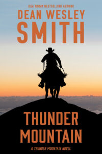
You want to see what I am talking about and the difference (not counting the insides and layout, just the cover)? Here are the cover images of the very first book in the series. Same art, one I did rebranding so my name and the title and series can be seen, the old one orange??? Really?

5 Comments
Harvey Stanbrough
I can relate. I just rebranded 54 of the 55 covers on my Blackwell Ops crime thriller series. With everything set up, it took me a day and a half.
With the specific cover art, I also branded to specific sagas inside the series. (For some POV characters one book was enough. For some, it took several books for them to tell their story.)
The originals weren’t bad, but my name (large) was at the bottom and the title and series brand were at the top. Those are reversed now, and I switched out or resized some of the art as well.
If anyone wants to look, they can see all 55 covers in 180×270 thumbnails at stonethreadpublishing[dot]com/blackwell-ops-series/.
dwsmith
Well done, Harvey. It’s going to take me a bunch of hours per book because I am changing everything, including the interiors to make the books readable, so they will get thicker and I will have to redo all the paper and do hardback covers and then large print. So I am figuring about five hours per book of work. And I think I have a couple of collections of Thunder Mountain short stories to add into the mix as well. Total fun for me.
Jámbor Balázs
So little changes, so big changes. It is interesting how a little change makes a different style. Cool.
dwsmith
Yup, difference between making your name big at the top and FILLING the top third of the book with your name. And making the name color something that can be seen. Orange just vanishes in thumbnail. Thanks!!
Vincent Zandri
Much better Dean. I need to do the same with many of my Bear Media books…