Playing With Covers
Branding and Sales…
Book covers do a lot of things. Some of it is subconscious for the buyer. And to get a book buyer to look at the sales copy, the cover must first do its job.
Job #1… Relay the author’s name in large letters at the top. This gives the reader the feeling the writer knows how to tell a story. This has been trained in for over a hundred years in publishing, with the phrase “Big Name Writer” always being a positive for a bestseller that a lot of readers love. The name must always be at the top and dominate the cover.
Job #2… The art and design needs to brand to the genre. That way the reader knows without looking that the book will be in a genre they like. Also does not hurt to flat out state the genre on the cover.
Job #3… The art needs to tel the reader clearly if it is fiction or non-fiction.
Job #4… The cover needs to brand both to the author’s brand and also if a series, to the series brand.
Job #5… For organization, the cover must relay the title of the book in a clear fashion. But nothing more. Titles do not sell books.
Job #6… Cover must feel professional, which usually means tag lines above the author’s name and below the title in smaller size. Author name must extend out close to the edges and the title can not be floating. Direction of the art, if there is a direction, goes from upper left to lower right to get the reader to open the book.
Let me give you an example of two professional-looking book covers. Both using the same art, both for my Cold Poker Gang novel BURN CARD. It is a mystery novel.
Old Book… Then New Book…
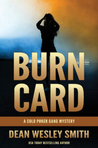
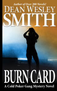
Again, both books have a professional look, but the first one sucks. The first older one was designed in kind of an arty feel, with the thinking that a title sells a book. Nope.
The new one was an test copy that I did in about thirty minutes tonight. It goes to my branding because it is my name (and every author’s names) that sells books. The first one put my name small at the bottom and why I let that happen we won’t go into at this point.
My title is more than clear enough and the MYSTERY NOVEL under it is almost large enough to see in thumbnail.
And frighteningly enough, this book is one of the better looking ones of the old look. This fall I will be rebranding and redoing the entire series with a new collection as well.
You may find the old one more striking, but the second one will sell books while the first one will not.
And clearly, in the past, I have been one of the indie writers who found a way to make sure my books would not sell. Working as quickly as I can to fix that problem.
8 Comments
Rob Vagle
Dean, could you elaborate on “title can not be floating” under #6?
dwsmith
Title just needs to look anchored usually to the bottom. Seen so many titles where it feels like it is just drifting in the middle of an open space. Makes readers feel uncomfortable and also is just bad design.
Jonathan
Thank you for this – I find your posts on practical issues like these really helpful (and I’m already changing my draft cover). I’m a new author (just finishing my second novel). Any suggestions about what I could put above the author name for someone starting out who cannot (yet 🙂 ) put ‘Best-selling author’ or equivalent?
dwsmith
See my answer to Jacob. Just say “author of… and put another story title above.
Brad D. Sibbersen
I was just a few weeks ago working with a cover artist and gave them a mockup of what I was thinking of. First comment: “You shouldn’t have your name in huge letters at the top like that. It looks egotistical.” Decided not to work with them. It took me years to get over that hangup.
dwsmith
Oh, wow… But they made my point. If your name is big at the top, you must be a good writer and thus the reader trusts you and buys your book.
Jacob
Is it worth putting a tagline above the author name if you’re not an established author and you don’t have an achievement to put there?
dwsmith
Absolutely. Advertise one of your other series. “Author of the Slap-Bang-Wow” Series!
It is a design feature mostly.