Smith’s Monthly Issues
Working on Three…
Sort of at the same time. I have so many unpublished short stories and basically three books I want to include in issues, I figured I might as well put all three issues together at the same time.
So, in other words, Smith’s Monthly is almost back!!
But the problem is that some of these stories I wrote three years ago and I have no memory of them, so sort of have to put them back in my head, and that takes time glancing back at them.
And putting a Marble Grant (one of my character’s in the Poker Boy universe) novel together because basically I wrote it as a series of linked short stories. And that is taking time.
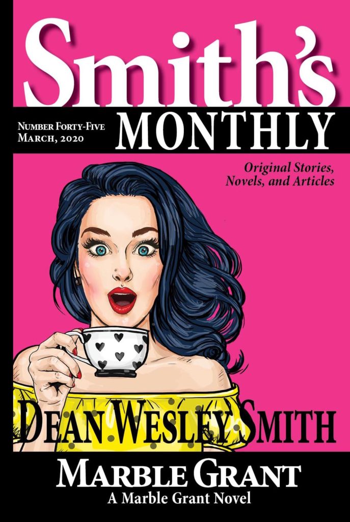
But already had a cover for it, so might use it, might not, for #45.
So, in other words, a fun evening of publishing stuff. I will do a video about all of it and more for the Publishing Challenge. Going to be doing videos there all year.
For now, here is the temporary front cover for #45. I hope to publish one issue per month starting in March, so that’s why I am trying to get ahead now. But this might not be the March issue. Not sure yet. Stay tuned.
And note: In paper, these are 7 x 10 double column with a lot of ads for my other books. In other words, it looks like a regular magazine.
7 Comments
Rocky
Hi, this is interesting, can’t wait for your books. I love that cover design.
JL Civi
Congrats, Dean!
Question: You’ve mentioned in the blog and in various videos how you almost never look back at a story or novel after it’s done.
This sounds like an (understandable) exception to that rule as you glance over the old works to get them back into your head for this purpose.
Any insights on how you handle that glance over process? How shallow/deep of a glance, any brief temptations to modify or edit, does critical voice try to surface only to be promptly vanquished, does creative voice enjoy the trip down memory lane, etc, etc…
Would love to hear you expand on this a little.
dwsmith
JL, oh, heavens, never once occurs to me to fix anything or touch it. Why would I? My critical voice sucks at writing anything. My creative voice is the power.
And mostly I only have to open the file, start into it reading, then go, “Oh, it’s that one!” Then I glance at the end to make sure my memory is what it is supposed to be and then get the story in the issue.
So no insights. But with as many stories as I am dealing with that have not been published scattered over the last two years, just finding them, opening them, and then once again trying to remember them is a struggle. It is hard for most people to grasp how many stories I have. Put it this way, a thick issue of Fiction River has about 15 stories in it. Same with Pulphouse. So sixty stories fills a full year of about 70,000 words of short fiction per issue. About 300,000 words of short fiction. I have more than that just unpublished at the moment, and between 400 to 500 short stories total, of which only about 220 have been published in Smith’s Monthly in the first 44 issues.
So it is nuts. I am getting organized. Do that sooner, rather than later. (grin)
K
Dean, a trim size question. You say Smith’s Monthly is 7×10 and looks like a regular magazine. I did some measuring of publications around the house, because 8.5×11 was stuck in my head. Yes, it turns out that Sports Illustrated, Cooks Illustrated, and a few other mags are 8.5×11. Comic books are 7×10. Pulphouse is also 7×10. It’s thicker than a regular magazine, and somewhat smaller. What led you to choose this trim size? Pros/cons? I’m deciding for my quarterly, and I want it to fit in with the magazines at the gym, the MD’s office, and so on.)
dwsmith
8.5 by 11 is a size for saddle stitched (stapled) web press printed magazines. Yup. Original Pulphouse was web press printed and that size. But from a person who did that process and paid for it, including color covers, you don’t want to go there. You want to stay POD, and when you get into POD at that size, the book is massive. Like coffee table book. The paper is thicker, remember, and it must have a spine, and so on. I know, we tried a sample at that size and it just didn’t feel right or look right. So we dropped back and tried one at digest size and that didn’t work either. So that’s why the best way to imitate a magazine look and feel is at 7 x 10.
But I would highly suggest you try some experiments on your own, see what works for you and your eye and feel. But got to hold it in your hand to know for sure, trust me. Give it a try. There are no right ways. We do Fiction River Anthology series at 6 x 9 paperback. Works wonderfully for a 70,000 word anthology of stories.
Also watch print size, columns, and so on. At 7 x 10 you can’t do one column for more than a few lines because an eye can’t track that far and return. That’s why Pulphouse is two-column format. Have fun.
Kate Pavelle
Massive thank-yous! It’s great to get real data from someone who’s done it! I will play around a bit… a lot will depend on my Vellum learning curve. Another quick question: Do you find it worthwhile to get your own ISBN for magazines, or do you think the free one through KDP is okay? On the fence here… I still have about 80 left and I see mainstream books in my future this year. They run into money after a while.
dwsmith
You can’t do double columns in Vellum. And you can’t make it look like a magazine with Vellum either. Vellum is great for simple, straight-forward books. A massive time saver, but for something just slightly more complex, you have to use InDesign to format the interior.
We only use our own ISBN numbers on trade paper, paper issues of magazines, and hardbacks. All electronic we just let the distributor (Amazon, Kobo, D2D) deal with the numbering systems.